
There are two types of layouts. Responsive, and unresponsive.
Basically, a responsive layout will shift and resize content to fit any display or device. This is what allows websites to take on a whole different appearance on a mobile device.
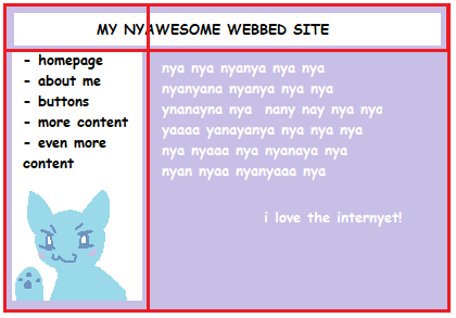
Dokodemo is an unresponsive website. That means all the content will be in the same place regardless of screen size. For this tutorial, we will be creating an unresponsive website. That's also the reason why we created a false body, to prevent content from automatically shifting and breaking.
There are many ways to go about creating a layout, but the most common options are Flexbox, CSS Grid, and (my personal favorite) tables.
I don't know much about Flexbox, so we won't be using that in this tutorial.
Tables are what I'm most used to, and my personal favorite. But because tables affect a sites accessibility, we won't be using them for this tutorial either.
CSS Grid is the easiest for beginners, even if it looks a little intimidating at first. It's based visually, and there are plenty of generators online.
Never, ever use float for layouts. Float should be used for graphics ONLY.
Now, this isn't a CSS grid tutorial so I won't go too in-depth in this section. There is enough information in the W3 link above to help you out more. I promise, it's not as scary as it looks. It's just very robust.
You can also mess around with generators to get a feel on how it works, and what code creates which results.
Let's reference our mockup again.
If we divide our mockup into a grid, it makes planning the code much easier.
Now, you can see the top box intersects the grid in the center.
With CSS grid, we can "merge" cells together to create larger boxes. This is why we want to plan out how many columns and rows our layout is going to have. So we know which cells to merge.
Keep in mind that you can still fill cells with entirely separate grids too, to create more complex layouts. The grid above is simply a starting point for the position of all the boxes.
For this layout, this is what my code will look like.
<div class="container">
  <div class="heading"></div>
  <div class="navigation"></div>
  <div class="mainContent"></div>
</div>
.container {
display: grid;
grid-template-columns: 300px 500px;
grid-template-rows: 100px auto;
gap: 0px 0px;
grid-template-areas:
"heading heading"
"navigation mainContent";
}
.heading { grid-area: heading; }
.navigation { grid-area: navigation; }
.mainContent { grid-area: mainContent; }